
The Reality of Conversion Rate Optimization in Digital Marketing
The client sold a high-ticket inventory management system. Their landing page checked all the standard industry boxes. Trust badges sat directly below the hero section. Customer testimonials covered the middle of the page. A detailed feature grid explained the software specifications. It looked like a professional, expensive website.
Users still bounced within twelve seconds.
When we look at poorly performing pages, we ignore assumptions. We track where the mouse actually stops. Digital marketing often focuses too heavily on getting people to the door. We care about what happens after they turn the handle.
The client had spent six weeks designing this page. They wanted to show off every feature their software had. They wanted to pre-qualify every single lead to save their sales team time. That desire for highly qualified leads created a massive wall between the user and the company.
Diagnosing the Drop-off Using Conversion Rate Optimization Tools
We installed basic session recorders and heatmaps on the landing page. We needed to see exactly what users were doing in real time.
The data revealed a harsh truth immediately.
Visitors landed, scrolled exactly halfway down to the contact form, and froze. We watched recordings of users hovering their cursors over the form fields. They would click into the first box, hesitate for five seconds, and close the browser tab.
The form demanded seven distinct pieces of information. It asked for name, work email, phone number, company size, annual revenue, job title, and a mandatory custom message.
Nobody wants to fill out a tax return just to get a software demo. Users saw the wall of input fields, calculated the mental effort required, and left. The heatmap showed heavy rage-clicking right around the “Phone Number” field. People do not want to give up their phone numbers. They know a phone number field guarantees aggressive cold calls from a sales representative within five minutes.
How Our Conversion Rate Optimization Services Fixed the Leak
We changed exactly one element on the page.
We completely ignored the design, the body copy, and the images. We cut the massive form down to just two fields: First Name and Work Email.
Then we changed the button text. The original button said “Submit Request”. That text feels like work. It feels like a commitment. We changed it to read “Get the Pricing Guide Now”.
Reduce friction. That is the core directive when we apply conversion rate optimization services to a failing campaign. Make the next step require zero mental effort. If a user has to think about whether they want to fill out a field, you have already lost them. We prioritized getting the user in the door over getting their entire professional biography upfront.
The Overnight Results
We pushed the updated page live at 4:00 PM on a Tuesday. We did not change the ad budget. We did not alter the targeting.
By Wednesday morning, the client had 14 new qualified leads sitting in their CRM.
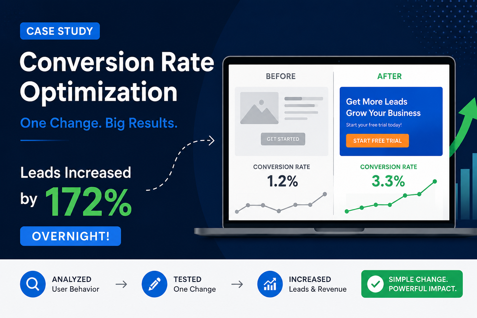
The conversion rate jumped from 0.4% to 4.2% in less than 24 hours. Their cost per acquisition dropped by over 80%. A campaign that was actively losing money became their most profitable lead source instantly.
This held steady. The volume continued at that pace for the rest of the quarter.
Why This Specific Conversion Rate Optimization Fix Worked
Every extra form field acts as a barrier. You lose a percentage of your audience with every piece of information you demand.
By asking only for an email, we removed the perceived risk of engaging with the brand. Users felt safe providing an email address to get the pricing guide. Once they had the email, the sales team could use it to nurture the prospect naturally over time.
Sales teams often push back against this approach. They want more data upfront. They want to know the company size before they get on a call. But a lead with only an email address is infinitely more valuable than a lead that abandoned your website because your form was too long. You can gather the company size and job title later.
Conversion optimization is about understanding user psychology. People are impatient. They protect their privacy. If you align your page with how people actually browse the internet, your numbers go up.
The Ongoing Process of Testing
A single fix rarely solves everything forever. Markets adapt. Ad fatigue sets in. Competitors change their offers.
We ran this initial form test as a massive course correction to stop the bleeding. Once the baseline conversion rate stabilized at 4.2%, we started testing the headline. We tested different hero images. We tested the placement of the testimonials. Small, incremental changes compound over time.
You need to keep testing. The data tells you exactly what your customers want. You just have to be willing to look at it and abandon your assumptions.
Frequently Asked Questions
What is the most critical element to test first on a landing page?
Start with your call-to-action and your form length. If your form is too long or your button copy is confusing, the best headline in the world will not save you. Simplify the required action before you change anything else.
How long does it take to see results from these tests?
You can see an immediate difference overnight if you remove a major friction point. If you have a broken form and you fix it, the leads will come in the next day. Complex, nuanced A/B tests require several weeks of traffic to reach statistical significance.
Do I need expensive software to fix my website?
No. You can start with low-cost heatmap tracking and standard Google Analytics. The goal is simply to find where users stop scrolling or where they abandon the page.
Should I use long-form or short-form landing pages?
It depends entirely on the price and complexity of your offer. A free newsletter signup needs a very short page. A $10,000 enterprise software package requires a longer page to address objections and build trust. Let your user behavior dictate the length.
Stop wasting your ad budget on pages that actively push customers away. Minor adjustments often create massive revenue shifts. If you are driving traffic but struggling to capture leads, we can find the exact point where your users are abandoning you. Reach out to us at OptMum Digital today to get your landing pages converting the way they should.